
Green Earth
Sustainability is a cause close to my heart, and this project gave me the chance to use design to share an important environmental message.
Green Earth, a new brand emphasizing sustainability and ethical fashion, seeks to address the lack of accessible and appealing options for young, environmentally conscious consumers who desire to make positive contributions through their clothing choices. Despite a growing awareness of environmental issues, there is a gap in the market for brands that combine a natural, earthy aesthetic with sustainable practices and messaging that resonates with the target audience. Green Earth aims to fill this void by offering a range of organic, minimalist designs that align with the values of conscious fashion, ultimately promoting a more sustainable approach to clothing consumption.
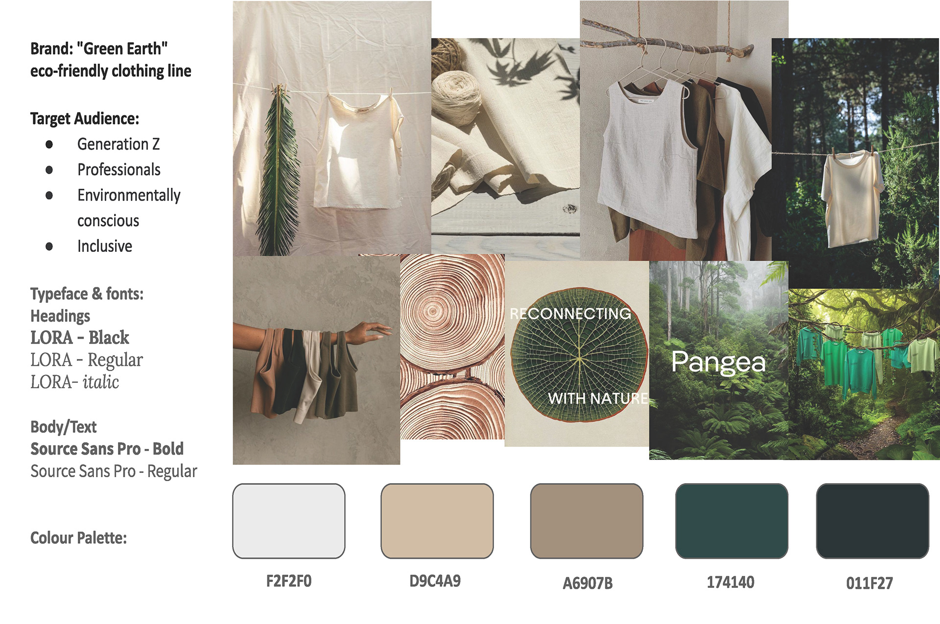
A color palette for Green Earth should reflect its focus on sustainability, ethical fashion, and a natural aesthetic. Earth tones like green, brown, and beige evoke nature and harmony. Soft neutrals such as white, cream, and gray add lightness and purity, complementing the earthy tones. Green variations can add depth, with lighter greens symbolizing growth and freshness, and darker greens representing stability. This palette conveys sustainability, natural beauty, and eco-friendliness, aligning with Green Earth's brand identity.
During the wireframing stage of designing the website for Green Earth, several key design decisions were made to ensure the site's functionality and user experience align with the brand's values and goals:
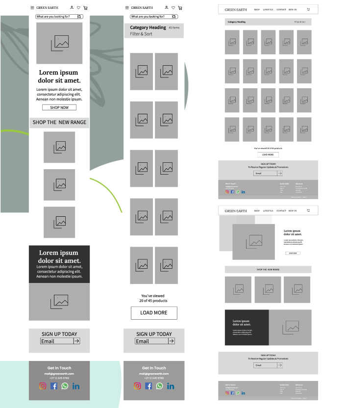
The layout was designed to be clean and minimalistic, reflecting Green Earth's aesthetic. The use of whitespace helps emphasise important content and creates a sense of simplicity.
The navigation menu was carefully planned to be intuitive and user-friendly. It provides easy access to different sections of the site, such as the product pages, sustainability information, and the brand's story.
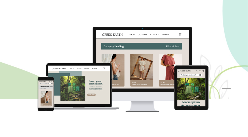
The wireframe was designed with responsiveness in mind, ensuring that the website functions well on various devices, including desktops, tablets, and smartphones.